


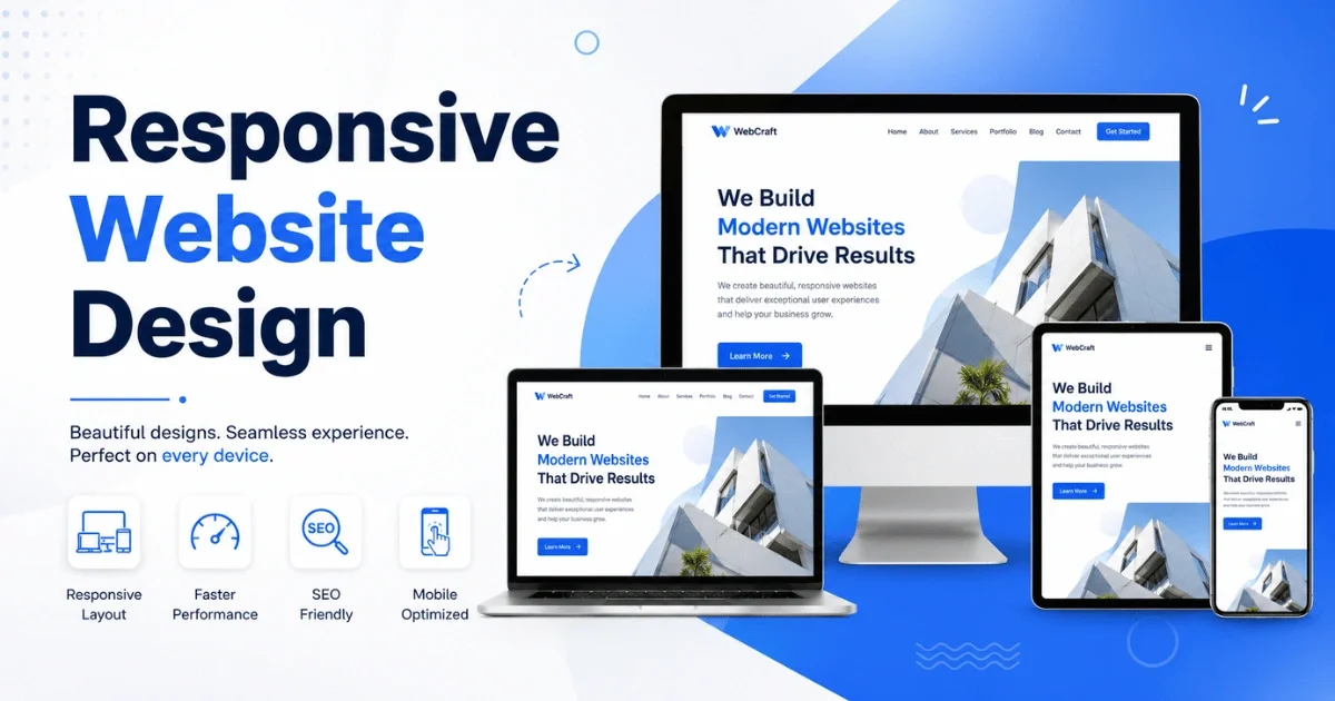
Responsive Website Design: Why It Matters for Your Business

A visitor lands on your website from their phone while waiting in line for coffee. If the text is too small to read, the buttons are impossible to tap accurately, and they have to pinch-zoom just to see your navigation menu, you've lost them — probably for good. They won't struggle with your site; they'll just leave and find a competitor whose site works properly on the device in their hand.
This scenario plays out millions of times a day. Mobile devices now account for roughly 60-64% of all global website traffic, and in markets like India that figure climbs past 77-80%. If your website isn't built to work seamlessly across screen sizes, you're not just delivering a poor experience to a few users — you're failing the majority of the people who try to reach you. That's what responsive website design solves, and it's why it has moved from a "nice-to-have" to a baseline requirement for doing business online.
What Is Responsive Website Design?
Responsive website design is an approach to building websites so that the layout, images, navigation, and content automatically adjust to fit whatever screen they're being viewed on — a large desktop monitor, a laptop, a tablet, or a smartphone — without needing separate versions of the site for each device.
Instead of designing one fixed layout, developers use flexible grids, scalable images, and CSS media queries that detect screen width and rearrange elements accordingly. A three-column layout on desktop might collapse into a single scrollable column on mobile. A horizontal navigation bar might become a collapsible hamburger menu. Font sizes, spacing, and button sizes all scale to remain usable and readable, regardless of device.
The goal is simple: one website, one URL, one set of content — but an experience that feels purpose-built for whichever device the visitor happens to be using.
Why Responsive Website Design Matters for Your Business
Your customers are overwhelmingly mobile: With mobile devices driving well over half of global web traffic — and considerably more than that in mobile-first markets — a website that isn't optimized for smaller screens is turning away the majority of its potential audience before they even see what you offer.
Google ranks mobile-friendly sites higher: Google has used mobile-first indexing for years, meaning it primarily evaluates the mobile version of your site to determine search rankings — even for searches performed on desktop. A non-responsive site is working against your SEO from day one, no matter how good your content is.
First impressions happen in seconds: Most visitors decide whether to stay on a website within the first few seconds of landing on it. A broken or clunky mobile layout signals that a business hasn't invested in its digital presence, and that impression transfers directly to how visitors perceive your credibility as a company.
It directly affects conversions and revenue: Poor mobile experiences are a major contributor to lost sales. Mobile shopping carts are abandoned at a noticeably higher rate than desktop carts, largely due to checkout friction, awkward form fields, and layouts that make it hard to complete a purchase. A responsive, well-optimized mobile experience closes that gap.
One website is easier — and cheaper — to maintain: Before responsive design became standard, some businesses built separate mobile sites (often on "m." subdomains). That meant duplicating content, managing two sets of updates, and dealing with SEO complications from having two versions of the same page. Responsive design eliminates that overhead entirely.
Key Features of a Responsive Business Website
A genuinely responsive website isn't just "a site that shrinks." It includes a specific set of technical and design characteristics working together:
- Fluid grid layouts that use relative units (percentages) rather than fixed pixels, so elements resize proportionally
- Flexible images and media that scale within their containing elements instead of overflowing or getting cropped awkwardly
- CSS media queries that apply different styling rules based on screen width, resolution, and orientation
- Breakpoints designed around common device categories (mobile, tablet, desktop, large desktop) so layouts reflow cleanly at each stage
- Touch-friendly navigation, including adequately sized buttons and tap targets, collapsible menus, and swipe-friendly carousels
- Readable typography that adjusts font size and line spacing for smaller screens without requiring zoom
- Optimized loading performance, since mobile users are frequently on slower or less stable connections than desktop users
- Consistent branding and content across devices, so the experience feels like the same business no matter how someone accesses it
Responsive Website Design vs Non-Responsive Website
| Aspect | Responsive Website | Non-Responsive Website |
| Layout | Automatically adapts to any screen size | Fixed layout, often unusable on mobile |
| Maintenance | One codebase, one set of updates | Often requires a separate mobile site |
| SEO | Favoured by Google's mobile-first indexing | Penalized in mobile search rankings |
| User experience | Consistent and intuitive across devices | Frustrating on smaller screens |
| Loading speed | Can be optimized per device | Often slow or resource-heavy on mobile |
| Cost over time | Lower long-term cost (single site) | Higher long-term cost (multiple versions) |
| Conversion rates | Higher, due to smoother mobile journeys | Lower, due to friction and abandonment |
| Future-proofing | Adapts to new device sizes automatically | Requires redesign for new device types |
How a Non-Responsive Website Can Affect Your Business
The damage from a non-responsive website rarely shows up as a single dramatic event — it's a slow, steady leak that's easy to underestimate.
Lost visitors and higher bounce rates: When mobile users encounter tiny text, misaligned buttons, or content that requires horizontal scrolling, most simply leave within seconds rather than fighting with the layout.
Lower search rankings: Because Google evaluates the mobile version of your site for ranking purposes, a poor mobile experience can suppress your visibility in search results even if your desktop site is excellent.
Damaged brand credibility: A broken or dated-looking mobile experience makes visitors question whether the business behind it is equally outdated — even if that's not a fair reflection of the company.
Missed revenue: Every visitor who leaves out of frustration is a missed inquiry, a missed sign-up, or a missed sale. For eCommerce specifically, poor mobile checkout flows are one of the leading contributors to cart abandonment.
Falling behind competitors: If a competitor's site works smoothly across every device and yours doesn't, the comparison is immediate and unfavorable — and it happens before the visitor even evaluates your actual product or service.
Wasted marketing spend: Every rupee spent driving traffic to your site — through ads, social media, or SEO — loses effectiveness if a meaningful share of that traffic lands on a site they can't comfortably use.
Industries That Need a Responsive Website
While every business benefits from responsive design, it's especially critical for:
- eCommerce and retail, where mobile shopping now represents a majority share of online sales and checkout friction directly costs revenue
- Healthcare and clinics, where patients frequently search for appointments, directions, or symptoms on their phones, often urgently
- Restaurants and hospitality, where diners look up menus, hours, and reservations almost exclusively on mobile
- Real estate, where buyers browse listings and photos on the go, often while physically near a property
- Education and e-learning, where students access course content and portals across a mix of phones, tablets, and laptops
- Professional services (legal, financial, consulting), where credibility and first impressions matter and mobile visitors are researching options quickly
- Travel and tourism, where bookings, itineraries, and last-minute changes happen predominantly from mobile devices
- B2B and SaaS companies, which, while historically more desktop-heavy, still see a significant and growing share of mobile research traffic before a purchase decision is made
How to Check If Your Website Is Responsive
You don't need to be technical to get a basic read on your site's responsiveness. A few practical checks:
- Resize your browser window. On a desktop, slowly drag the edge of your browser window narrower. A responsive site will reflow its layout smoothly; a non-responsive one will simply get cut off or force horizontal scrolling.
- Use Google's Mobile-Friendly Test. Google offers a free tool where you enter your URL and get a direct pass/fail assessment along with specific issues found.
- Check Google Search Console. If you have access, the "Mobile Usability" report flags specific pages with mobile issues, like text too small to read or clickable elements too close together.
- Open your actual site on multiple real devices. Emulators are useful, but nothing replaces checking your site on an actual phone, tablet, and desktop to see real rendering and touch behaviour.
- Use browser developer tools. Most browsers let you simulate different device screen sizes directly within developer tools (usually accessible via right-click → Inspect → device toolbar).
- Test page speed on mobile. Tools like Google Page Speed Insights show a separate mobile score, since mobile performance issues are often distinct from desktop ones.
When Should You Consider a Website Redesign?
Not every responsiveness issue requires starting from scratch, but certain signs indicate it's time for a proper redesign rather than patchwork fixes:
- Your site was built more than 3-5 years ago and hasn't been updated to current design and technical standards
- You're seeing a high mobile bounce rate compared to desktop in your analytics
- Your site fails Google's Mobile-Friendly Test or shows repeated issues in Search Console
- Loading times on mobile are noticeably slow, especially on average network conditions
- Your business has grown or repositioned since the site was built, and the current design no longer reflects your offerings or brand
- You're relying on a separate "mobile site" rather than a single responsive codebase
- Your competitors' websites now offer a visibly smoother, more modern experience than yours
- You're planning to add new functionality (bookings, payments, portals) that your current site's architecture can't comfortably support
How Professional Responsive Website Development Can Help
DIY website builders have improved significantly, but a professionally developed responsive website offers advantages that template-based tools often can't match:
- Custom-built breakpoints and layouts tailored to your actual content and user journeys, rather than generic templates stretched to fit
- Performance optimization at the code level — compressed assets, efficient loading strategies, and clean code that loads quickly across devices and connection speeds
- SEO-conscious architecture built with mobile-first indexing, semantic HTML, and technical SEO best practices from the ground up
- Accessibility considerations, ensuring the site works well for users relying on screen readers, keyboard navigation, or assistive technology
- Scalability, so the site can accommodate new features, pages, or integrations as the business grows, without needing a full rebuild
- Cross-browser and cross-device testing, catching rendering issues across the many browser and device combinations real users actually have
- Ongoing support and maintenance, keeping the site current as browsers, devices, and security standards evolve over time
Working with an experienced development team also means the responsive strategy is built around your specific business goals — conversion paths for eCommerce, lead capture for service businesses, or content readability for publishers — rather than a one-size-fits-all template. You must see Responsive Website: A Business Necessity in 2026 by Video Verse Web that explain the need of mobile-ready web application.
Conclusion
Responsive website design isn't a technical detail buried in the fine print of a development contract — it's a direct reflection of how seriously a business takes its customers' experience. With the majority of web traffic now coming from mobile devices, a website that only works well on desktop is, in practical terms, failing most of the people who visit it. The businesses that treat responsive design as a foundation rather than an afterthought consistently see the benefits: better search visibility, lower bounce rates, higher conversions, and a brand that feels credible no matter what device someone uses to find it. If your site hasn't been evaluated for responsiveness recently, there's rarely been a more important time to check.