



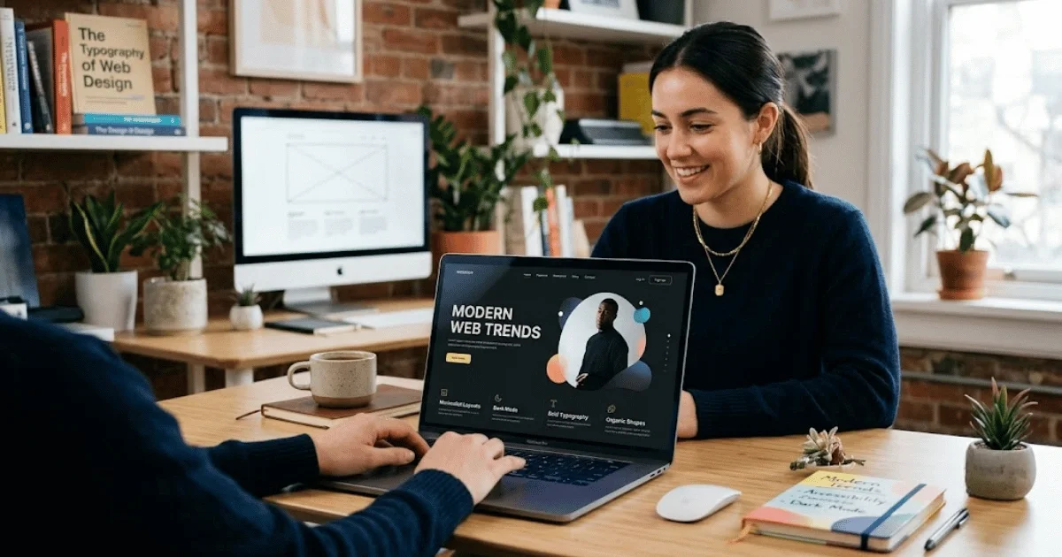
Website Design Trends Businesses Should Know

Your website has about 50 milliseconds to convince a visitor you're legit — before they've read a single word. That's the reality businesses are designing for in 2026: faster judgments, more mobile traffic, higher expectations, and a web where 96% of homepages still fail basic accessibility checks. This guide breaks down the 10 website design trends actually shaping business sites this year — from bold "dopamine" color palettes and kinetic typography to AI-adaptive interfaces and accessibility-first builds — plus how to tell which trends are worth chasing versus which timeless principles you should never compromise on. Whether you're planning a full redesign or just want your site to stop looking dated, this is the practical, no-fluff rundown to work from.
Why Modern Website Design Matters for Businesses
Before getting into specific trends, it's worth grounding this in a hard truth: your website's design isn't a cosmetic afterthought — it's a trust mechanism that operates faster than conscious thought.
Research from Carleton University found that people form an opinion about a webpage's visual appeal in as little as 50 milliseconds — a tenth of the time it takes to blink. Google later ran its own internal study and found some of those snap judgments form in as little as 17 milliseconds. That's not enough time to read a headline, evaluate your product, or understand your value proposition. It's purely visual, and it's happening below the level of conscious thought.
That first impression matters more than most business owners assume. The Stanford Web Credibility Project found that nearly half of users — 46.1% — judge a website's credibility primarily by how it looks, not by what it says. Design isn't decoration sitting on top of your content; for a huge share of visitors, design is the evidence they use to decide whether to trust you.
Speed compounds this effect. Research cited by web.dev and Deloitte found that shaving just one-tenth of a second off page load time increased retail conversion rates by 8.4% and lead-generation form completions by over 21%. And this isn't a desktop-only concern anymore. Depending on whose tracking you trust, mobile devices now account for somewhere between roughly 52% and 64% of global web traffic, with Stat Counter's most recent quarterly read putting it just over half worldwide — and considerably higher in mobile-first markets like India and across Africa. If your site isn't genuinely mobile-first, you're optimizing for a shrinking minority of your own audience.
10 Website Design Trends Businesses Should Know
1. Bold, "Dopamine" Color Palettes
After nearly a decade of muted minimalism, saturated, high-energy color palettes are making a comeback, driven by Y2K nostalgia and "dopamine design" aesthetics. Think neon gradients and high-contrast color pairings instead of soft pastels. This works especially well for lifestyle, beauty, hospitality, and youth-oriented brands that want to feel alive and current rather than corporate.
2. Kinetic, Scroll-Driven Typography
Type is no longer a passive label sitting under a hero image — it's becoming the interface itself. Designers are using viewport-scaled fonts so a single word can stretch edge-to-edge across the screen, with font weight and width shifting dynamically as the user scrolls. It's a deliberate move away from stock photography toward typography as the primary visual statement — and it's lighter on page weight than large hero images, which helps performance too.
3. Bento Grid Layouts
Borrowed from Japanese lunch boxes and popularized by Apple's product pages, the bento grid — a modular arrangement of differently sized content blocks — has become one of the default layouts recommended by major website builders for organizing dense information like feature comparisons, portfolios, or dashboards into clean, scannable sections.
4. AI-Powered Contextual and Adaptive Interfaces
Rather than showing every visitor an identical homepage, sites are increasingly tailoring content and calls-to-action to context — time of day, location, referral source, or browsing behavior. This is one of the clearer "AI in production" trends: not chatbots bolted onto a site, but interfaces that quietly reorganize themselves around what a specific visitor is likely to need.
5. Immersive 3D and WebGL Elements
Using WebGL, sites are moving beyond static product photography toward interactive 3D models, scroll-triggered animation, and AR-style previews — letting a visitor spin a product 360 degrees or virtually walk through a space. This is powerful for e-commerce and real estate, but it's also the trend most likely to hurt performance if implemented carelessly, so it needs a genuine technical budget behind it.
6. Glassmorphism 2.0
The frosted-glass, translucent-panel look had a moment a few years ago and got dismissed as something that looked good in design mockups but fell apart in production. It's back in 2026, but implemented with far more restraint — used for specific UI elements like navigation bars and cards rather than across an entire page — so it reads as sophisticated rather than gimmicky.
7. Broken Grids and Asymmetric Layouts
Standard "hero, three-column features, footer" templates are giving way to intentionally irregular layouts with overlapping elements — signaling that a real human made deliberate design choices rather than dropping content into a generic template. This is most visible right now among fashion, cultural, and creative-agency sites, and it's spreading into tech and other sectors that want to differentiate from competitors running the same page builder theme.
8. Resonant Minimalism
This isn't the cold, sterile minimalism of a decade ago. It pairs ultra-thin fonts, soft gradients, and generous whitespace with subtle animation and micro-interactions, stripping a page down to essentials while keeping it feeling warm and human rather than clinical.
9. Earthy, "Nature-Distilled" Color Palettes
As a counter-trend to the dopamine palettes above, many brands — particularly in wellness, finance, and professional services — are shifting toward muted, organic tones inspired by skin, wood, and soil, echoing Pantone's 2026 Color of the Year direction toward soft, sophisticated neutrals. It signals calm, trustworthiness, and restraint.
10. Accessibility-First, Performance-Driven Design
This is the trend businesses most often skip — and the one with the most measurable downside. WebAIM's annual scan of the top one million homepages found that in 2026, 96% of home pages had at least one detectable WCAG accessibility failure, averaging 56 errors per page — a number that's actually gotten worse, not better, as pages have grown more complex. The most common failures haven't changed in seven years running: low-contrast text alone appears on nearly 84% of homepages, and missing alt text affects over half of all pages analyzed. Building with sufficient color contrast, proper alt text, and labeled form fields isn't a compliance chore — it's a competitive advantage most competitors are still failing to deliver.
Website Design Trends vs. Timeless Design Principles
Not everything that's fashionable is worth chasing, and not everything unfashionable is worth abandoning. It helps to separate the two categories clearly:
Trends are surface-level and time-bound: colour palettes, layout styles, animation choices, typographic treatments. They shift every 12–24 months and signal "this site was built recently" — valuable, but disposable. Chasing every one of them is how a site ends up looking dated within a year, because heavy trend-driven redesigns age faster than restrained ones.
Timeless principles don't expire, because they're rooted in how humans actually process information, not in aesthetic fashion:
- Visual hierarchy — guiding the eye to what matters most first, through size, contrast, and placement, rather than presenting everything with equal visual weight.
- Clarity of navigation — a visitor should never have to think about how to find something.
- Speed and performance — no aesthetic trend is worth a load time that costs you the conversion gains cited earlier.
- Accessibility — a legal and ethical baseline, not a design flourish, and one most competitors are still getting wrong.
- Consistency — predictable patterns for buttons, spacing, and typography build unconscious trust.
- Mobile-first responsiveness — non-negotiable given that more than half of global traffic is now mobile.
The businesses that age well online treat trends as seasoning and timeless principles as the meal. A site built on strong fundamentals can absorb a fresh coat of trend-driven paint every couple of years without a full rebuild. A site built entirely around one trend has no foundation to fall back on once that trend fades.
How to Choose the Right Design Trends for Your Business
Not every trend fits every business, and adopting one because it's popular — rather than because it fits your brand and audience — is one of the fastest ways to waste a redesign budget. A few filters worth applying before committing to any trend:
- Match it to your audience's expectations: A bold, maximalist dopamine palette works for a youth fashion brand; it will actively undermine trust for a B2B accounting firm, where a calmer, more restrained aesthetic (like the nature-distilled palette trend) signals reliability instead.
- Match it to your device mix: If your analytics show 70–80% of your traffic is mobile — common for restaurants, home services, and local businesses — prioritize trends that perform well on small screens (bento grids, resonant minimalism) over ones that lean on desktop-scale immersive 3D.
- Weigh it against your performance budget: Immersive WebGL and heavy scroll-driven animation look impressive but can tank load times if your team doesn't have the technical resources to optimize them properly. If in doubt, choose the lighter-weight trend.
- Check it against your brand personality, not just the calendar year: A trend should express something already true about your brand, not paper over the absence of a clear brand identity.
- Prioritize what compounds: Accessibility and performance improvements benefit every visitor, in every market, indefinitely. A trendy hero animation benefits some visitors, for a couple of years, until it looks dated. When budgets are limited, fund the former before the latter.
A practical approach: pick one or two visual trends that reinforce your brand story, and treat accessibility, speed, and mobile responsiveness as baseline requirements, not optional add-ons.
Common Website Design Mistakes to Avoid
- Chasing every trend at once: A site that layers dopamine colors, glass morphism, kinetic type, and 3D elements together doesn't read as cutting-edge — it reads as unfocused and slows down badly.
- Ignoring accessibility: With low contrast text alone present on nearly 84% of homepages and unlabeled form fields on roughly half of them, this is the single most common — and most fixable — mistake on the web. It's also a legal liability in many jurisdictions.
- Treating mobile as secondary: With mobile traffic at rough parity with or ahead of desktop globally, and running considerably higher in food service, home services, and several international markets, a "desktop-first, mobile-adapted" build process gets the priority backwards.
- Sacrificing speed for visual flourish: Given that even a tenth-of-a-second improvement in load time measurably lifts conversions, unoptimized hero videos, unnecessary animation libraries, and bloated image files are a direct revenue leak, not just a technical nitpick.
- Unclear navigation and calls-to-action: Nonlinear, exploratory navigation can look striking on a portfolio or fashion site, but for a business site where visitors need to find pricing, contact info, or a "Book Now" button, clarity should always win over cleverness.
- No clear visual hierarchy: When every element competes for attention — bold text everywhere, no whitespace, no size variation — visitors don't know where to look first, and many just leave.
- Redesigning around trends instead of data: Rebuilding a site because a trend article said so, without checking analytics, heatmaps, or user feedback first, risks fixing things that weren't broken and leaving the things that actually cause drop-off untouched.
The Future of Business Website Design
A few structural shifts are shaping where business websites are headed next, beyond this year's specific aesthetic trends:
AI moves from novelty to infrastructure: The chatbot-bolted-onto-a-corner-of-the-page phase is giving way to AI genuinely restructuring pages in real time — adaptive layouts, personalized content ordering, and AI-assisted design tools (in platforms like Figma and Framer) that let smaller businesses produce work that previously required a full design team.
Performance and accessibility become differentiators, not afterthoughts: As page complexity keeps rising — Web AIM found the average homepage element count jumped over 22% in a single year, nearly doubling since 2019 — sites that stay lean, fast, and accessible will increasingly stand out simply by not adding to that bloat. Expect this to become a more explicit selling point for businesses, not just a compliance checkbox.
Human-made signals become a selling point: As AI-generated design and template-driven sites flood the market, deliberately imperfect, asymmetric, human-feeling design becomes a way to visually signal "a real person made thoughtful decisions here" — the opposite instinct from the polished-template era of the 2010s.
Voice, conversational, and agentic interfaces grow alongside traditional pages: As AI agents increasingly browse and transact on behalf of users, businesses will need to think about how their site structure and content are read by machines, not just humans — clean semantic HTML and structured data will matter for a new kind of "visitor."
The mobile-first mandate only strengthens: With smartphone-first internet access continuing to expand fastest in emerging markets, and mobile commerce growing faster than desktop, the businesses treating mobile as an equal (or primary) platform — not a scaled-down afterthought — will keep pulling ahead.
Conclusion
Website design trends are worth watching, but they're not the foundation of a website that actually performs for your business. The businesses that win online pair a couple of well-chosen, on-brand trends with the fundamentals that never go out of style: fast load times, clear navigation, strong visual hierarchy, and genuine accessibility. Given that visitors form credibility judgments in roughly the time it takes to blink, and that the vast majority of homepages are still failing basic accessibility checks, the highest-leverage move for most businesses in 2026 isn't chasing the flashiest new aesthetic — it's fixing the fundamentals that trend articles rarely mention, then layering one or two current trends on top with intention.